Call to Action: How to Write a High-Converting CTA in 8 Simple Tips

A call to action (CTA) is a powerful prompt designed to guide users toward taking a specific action. Whether it’s “Buy Now,” “Subscribe,” “Learn More,” or “Get a Free Trial,” the goal of a call to action is simple – to turn passive visitors into active participants.
Think of it as the nudge that moves people from being interested in your content to actually engaging with your brand.
Read More: Referral Traffic: 10 Quick & Easy Ways to Get More (+Examples)
Why CTAs Matter
Clear and compelling call to action messages are not just nice-to-have – they’re essential for driving results.
According to a study by Unbounce, websites that use well-designed CTAs see an increase in conversion rates by up to 161%. That’s a massive boost in turning visitors into leads or customers.
Beyond the numbers, the role of a call to action in the user journey is fundamental. Imagine visiting a website filled with great information but no direction on what to do next – frustrating, right?
A strong CTA acts as a bridge between a user’s curiosity and the next logical step. For example, after reading an insightful article on healthy eating, a user might see a CTA saying, “Download our Meal Plan Guide” – making it easy for them to engage further.
Moreover, businesses that test different CTA designs, placement, and wording often find significant differences in performance.
Even small changes, like switching from “Submit” to “Get Your Free Ebook,” can lead to a substantial increase in user action.
In summary, the call to action is the key element that helps turn website visitors into loyal customers, making it an indispensable part of digital marketing strategies.
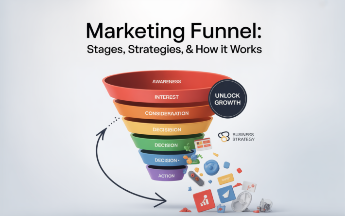
Read More: Marketing Funnel: 5 Stages, Proven Strategies & How It Works
Use Action-Oriented Language in Your Call to Action

When crafting a call to action, using action-oriented language is one of the most effective ways to prompt users to act immediately.
Instead of vague or passive phrases, a powerful call to action should be direct, commanding, and clear about the benefit the user will get.
For example, instead of saying “Submit your information,” a stronger and more action-driven CTA would be “Download Your Free Guide” or “Start Your Free Trial.”
These phrases leave no doubt in the user’s mind about what they need to do next and what they will receive in return.
Studies show that action-oriented CTAs improve conversion rates significantly. According to HubSpot, using clear action verbs in CTAs can boost click-through rates by over 80%. This proves how crucial direct language is in cutting through user hesitation.
Tailor the Call to Action to User Intent
Not all CTAs are created equal – the best ones are tailored to match where the user is in their buying journey. For example:
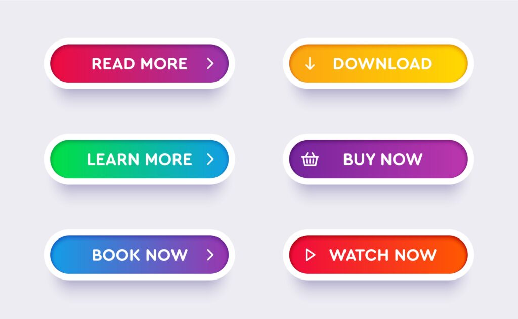
- At the awareness stage, use a softer CTA like “Learn More” or “Discover the Benefits” to educate users without pushing for a sale.
- At the consideration stage, something like “Get a Free Demo” or “Compare Plans” helps users evaluate options.
- Finally, when the user is ready to make a purchase, a bold call to action such as “Buy Now” or “Claim Your Discount” encourages immediate decision-making.
A well-placed and appropriately worded call to action not only improves the user experience but also dramatically increases the chances of conversion.
For example, an e-commerce site saw a 35% increase in sales simply by changing a CTA from “Learn More” to “Shop Now,” aligning the message with the buyer’s intent.
In conclusion, using action-oriented language and tailoring the call to action to the user’s intent makes your message more compelling, helping you guide visitors effectively through your sales funnel.
Read More: How to Generate Leads on LinkedIn: 6 Expert Tips & Strategies
Create a Sense of Urgency in Your Call to Action
A highly effective call to action doesn’t just tell users what to do – it gives them a reason to act right away. One of the best ways to do this is by creating a sense of urgency.
Time-sensitive phrases motivate users to move quickly, reducing the chance they’ll procrastinate and forget about your offer.
Examples of urgency-driven CTAs include “Limited Time Offer,” “Only a Few Left,” or “Register Before Midnight.” These phrases tap into a natural fear of missing out (FOMO), which drives immediate action.
For instance, an online course provider saw a 27% increase in sign-ups when they added “Enroll by Sunday to Secure Your Spot” to their CTA.
However, it’s essential to balance urgency with authenticity. Overusing urgent language or making false claims can erode trust. Users are savvy and can often spot exaggerated urgency.
For example, instead of saying “Hurry! Only 1 Left!” when hundreds of items are in stock, a genuine call to action like “Offer Ends in 24 Hours” maintains credibility while encouraging action.
According to research by MarketingExperiments, urgency combined with clear, honest messaging boosts conversion rates by up to 30% compared to standard CTAs without urgency.
In summary, a well-crafted call to action that creates real urgency helps users feel motivated to act now, while maintaining trust in your brand. It’s a simple yet powerful tool to turn interest into immediate engagement.
Read More: Lead Nurturing Emails: Complete Guide with Real-Life Examples
Offer a Clear Value Proposition in Your Call to Action
A powerful call to action doesn’t just tell users what to do – it explains why they should do it. To stand out, your CTA must highlight the value it delivers, focusing on benefits rather than just features.
For example, instead of a simple, vague instruction like “Download our app,” a more compelling call to action would say, “Download our app to save time and increase productivity.”
This approach directly communicates the benefit the user will get, making it much more persuasive.
Data shows that CTAs focusing on clear benefits perform significantly better. According to WordStream, benefit-driven CTAs have a 200% higher conversion rate compared to feature-focused or generic CTAs.
A well-crafted call to action also addresses the user’s pain points. For instance, if a user struggles with managing multiple passwords, a CTA like “Simplify your login experience – Get our Password Manager Today” speaks directly to their problem and offers a solution.
This makes the action feel less like a marketing push and more like a helpful step toward solving a real need.
Let’s take a real-world example: Dropbox used the CTA “Keep your files safe and accessible anywhere – Sign Up Free.” This clearly shows the value of using their service, rather than simply asking users to create an account.
In conclusion, an effective call to action clearly presents the value and solves a user’s pain point, turning vague prompts into powerful motivators that lead to action.
Read More: Content Performance: 11 Proven Tips for Maximum Results in 2025
Keep It Short and Sweet in Your Call to Action
When it comes to a call to action, less is often more. Users tend to skim through content quickly, especially online, so your CTA should be easy to understand at a glance. The best practice is to keep your messaging concise—ideally between 2 to 5 words.
For example, instead of a long-winded CTA like “Click here to learn more about our exclusive service and get started today,” a much stronger and clearer option would be “Learn More” or “Get Started.” Short CTAs make it obvious what the user needs to do next, reducing decision fatigue.
According to a study by HubSpot, CTAs with fewer than 5 words tend to perform better by up to 20% in terms of click-through rates compared to longer ones. That’s because short, punchy phrases grab attention and prompt quicker action.
Additionally, avoiding information overload in your call to action prevents user confusion. A cluttered message can cause hesitation.
For instance, instead of saying, “Download our free app, fill out your profile, and start managing your projects instantly,” a more effective CTA would be simply “Download Free App.”
Real-world examples demonstrate this well. Amazon uses CTAs like “Buy Now” or “Add to Cart,” which are clear, direct, and easy to act on. This simplicity contributes to a smoother user experience and higher conversion rates.
In summary, a clean, concise call to action improves clarity, eliminates confusion, and leads to faster user engagement. Short and sweet wins the race.
Read More: Keyword Trends 2025: 10 Things You Need to Know
Design for Visibility in Your Call to Action
A great call to action isn’t just about what you say – it’s also about where and how you present it. Designing your CTA for maximum visibility ensures it gets noticed and drives results.
Strategic Placement
Where you place your call to action makes a big difference. The most effective spots include:
- Above the fold: This ensures users see your CTA immediately without needing to scroll.
- At the end of content: After providing valuable information, a well-placed CTA encourages users to take the next step.
- Sticky headers or footers: These stay visible as users scroll, offering a constant opportunity to engage.
For example, an online magazine that placed “Subscribe Now” in a sticky footer saw a 22% increase in newsletter sign-ups compared to placing it only at the bottom of articles.
Contrasting Colors
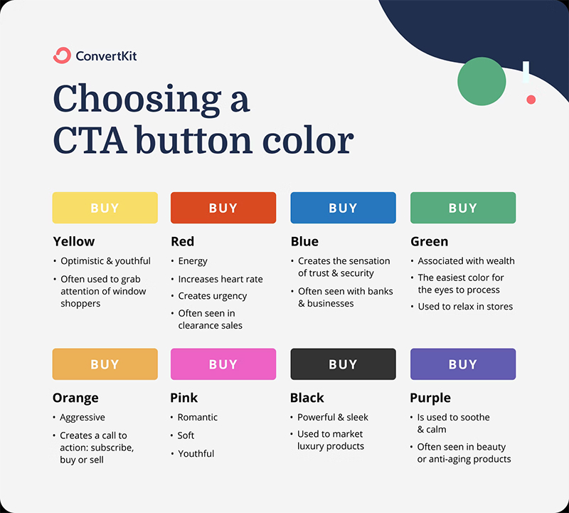
A call to action needs to stand out visually. Using contrasting colors ensures the button grabs attention without clashing with your overall design.
For instance, if your website’s background is light blue, a bright orange or red CTA button draws the eye naturally.
According to a study by HubSpot, CTAs with contrasting colors increased conversions by 21% compared to less visually distinct ones.
Read More: Google Rolls Out Verified Badge for Local Services Ads
Responsive Design
With more than 55% of web traffic coming from mobile devices (Statista, 2023), making your call to action mobile-friendly is essential. Buttons should be large enough to tap easily and placed where they remain visible without excessive scrolling.
An e-commerce site improved mobile conversions by 28% simply by making their “Buy Now” CTA button larger and easier to tap on smartphones.
In conclusion, a well-designed call to action combines smart placement, eye-catching colors, and mobile responsiveness. These elements together make it easy for users to notice, understand, and act on your message.
Read More: Google Rolls Out August 2025 Spam Update
Use First-Person Perspective in Your Call to Action
One of the simplest yet most effective ways to make your call to action more engaging is by using a first-person perspective. This small shift in language makes the message feel personal, helping users connect with it on a deeper level.
Instead of generic CTAs like “Subscribe Now” or “Get Your Free Guide,” try something more personal and inviting, such as “Yes, I Want In” or “Send Me the Free Guide.”
These first-person statements transform the action from a distant instruction into something the user feels they are choosing for themselves.
Data supports this approach. Research from Experian shows that personalized calls to action can boost conversion rates by up to 202% compared to standard CTAs. That’s because first-person language makes the user feel involved and in control.
For example, an online fitness program changed their CTA from “Join Our Program” to “Yes, I Want to Get Fit” and saw a 35% increase in sign-ups. The personal tone made users feel they were making a decision that directly benefits them.
Using a first-person perspective in your call to action doesn’t just improve engagement – it builds a connection. It turns a simple click into a small personal commitment, making the user feel heard and understood.
In summary, a first-person call to action feels more personal and inviting, helping users act because it speaks directly to their needs and desires.
Read More: How to Find Guest Post Opportunities | “Write for us”
Test and Optimize Your Call to Action
Creating a powerful call to action doesn’t stop after writing the perfect message. To truly maximize its impact, you need to test and optimize regularly. This ensures your CTA keeps performing at its best as user preferences and trends evolve.
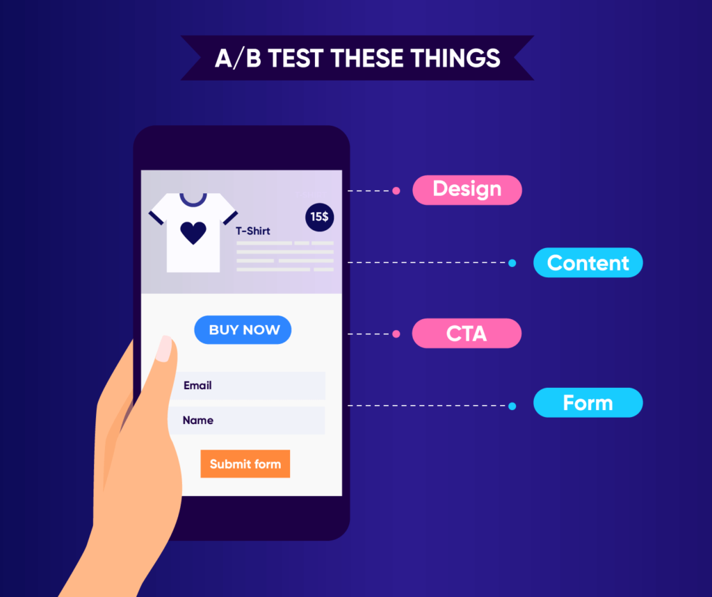
A/B Testing
A/B testing is a smart way to experiment with different call to action texts, designs, colors, and placements.
For example, you might test “Get My Free Guide” versus “Send Me the Free Guide” to see which phrasing drives more clicks. Even small changes can have a huge impact.
Data from Invesp shows that businesses that run regular A/B tests on their CTAs can increase conversion rates by up to 49%.
One online retailer discovered that changing the CTA button text from “Learn More” to “Shop Now” led to a 23% increase in purchases.
Analyze Performance Metrics
To understand what works, it’s important to monitor key performance metrics such as:
- Click-Through Rate (CTR): How many users clicked your CTA.
- Conversion Rate: How many completed the desired action.
- User Behavior: Time spent on page, scroll depth, etc.
Using tools like Google Analytics or Hotjar helps visualize where users click and how they interact with your call to action. This data is essential for knowing which variations perform best.
Iterate Based on Data
The most successful CTAs are not static. By analyzing test results and user behavior, you can continually refine your approach.
For instance, if data shows users respond better to urgency, you can test CTAs like “Claim Your Spot – Ends Tonight” versus “Sign Up Now.”
An SaaS company improved their trial sign-up rate by 40% simply by switching from “Start Trial” to “Yes, I Want My Free Trial.”
In conclusion, optimizing your call to action through testing and data-driven improvements keeps your messaging sharp, relevant, and highly effective over time.
Align Your Call to Action with User Expectations
An effective call to action doesn’t just stand out—it feels natural and aligned with what the user expects. When your CTA matches the message of your content, users are more likely to trust it and follow through.
Consistency with Content
Your call to action should reflect the tone, purpose, and message of the content it appears in. For example, after an in-depth article about the benefits of email marketing, a CTA like “Download the Ultimate Email Marketing Guide” feels like a natural next step. It builds on the user’s interest rather than appearing out of context.
Data from Adobe shows that consistent messaging across content and CTAs improves user engagement by up to 23%. When users see a CTA that aligns with what they’ve just read, they feel understood and guided, not sold to.
A poor example would be placing a generic “Contact Us” CTA after an educational blog post when the user wasn’t ready for direct interaction. Instead, a well-aligned call to action might say, “Learn How to Apply These Strategies” with a link to a related resource.
Clear Next Steps
One of the biggest frustrations for users is uncertainty about what happens next. Your call to action should clearly communicate the next step in the process. For instance, instead of a vague “Click Here,” a better CTA would say “Download Your Free Ebook – Instant PDF Access” or “Get My Free Trial – No Credit Card Required.”
According to research by Nielsen Norman Group, users are better able to complete tasks when CTAs communicate clear next steps, reducing friction and increasing trust.
For example, an online course platform that changed its CTA from “Enroll Now” to “Yes, I Want Instant Access to the Course” saw a 32% increase in sign-ups because users knew exactly what to expect.
In summary, aligning your call to action with user expectations—both in tone and clarity of next steps—makes it easier for users to engage without hesitation, improving conversions and building trust.
Conclusion
Crafting a high-converting call to action is both an art and a science. Let’s quickly recap the 8 powerful tips that can help your CTAs perform at their best:
- Use Action-Oriented Language – Be direct and commanding, using verbs that prompt immediate action like “Get Started Today” or “Download Now.”
- Tailor to User Intent – Match your CTA to where the user is in their journey, such as “Learn More” for awareness or “Buy Now” at the decision stage.
- Create a Sense of Urgency – Use time-sensitive phrases like “Limited Time Offer” or “Register Before Midnight” to encourage fast action.
- Offer a Clear Value Proposition – Focus on the benefit users will get, e.g., “Download our app to save time and increase productivity,” rather than just “Download our app.”
- Keep It Short and Sweet – Limit your CTA text to 2–5 words for clarity and quick comprehension, helping users act without overthinking.
- Design for Visibility – Place CTAs above the fold or in sticky headers, use contrasting colors, and ensure they are mobile-friendly to grab attention.
- Use First-Person Perspective – Personalize the experience with phrases like “Yes, I Want In” to make the action feel more engaging.
- Test and Optimize – Continuously A/B test different CTA texts, colors, and placements, and analyze performance metrics like CTR and conversion rates to improve over time.
Now is the perfect time to implement these strategies into your own call to action. Small changes can lead to big results in engagement and conversions, so start experimenting today.